

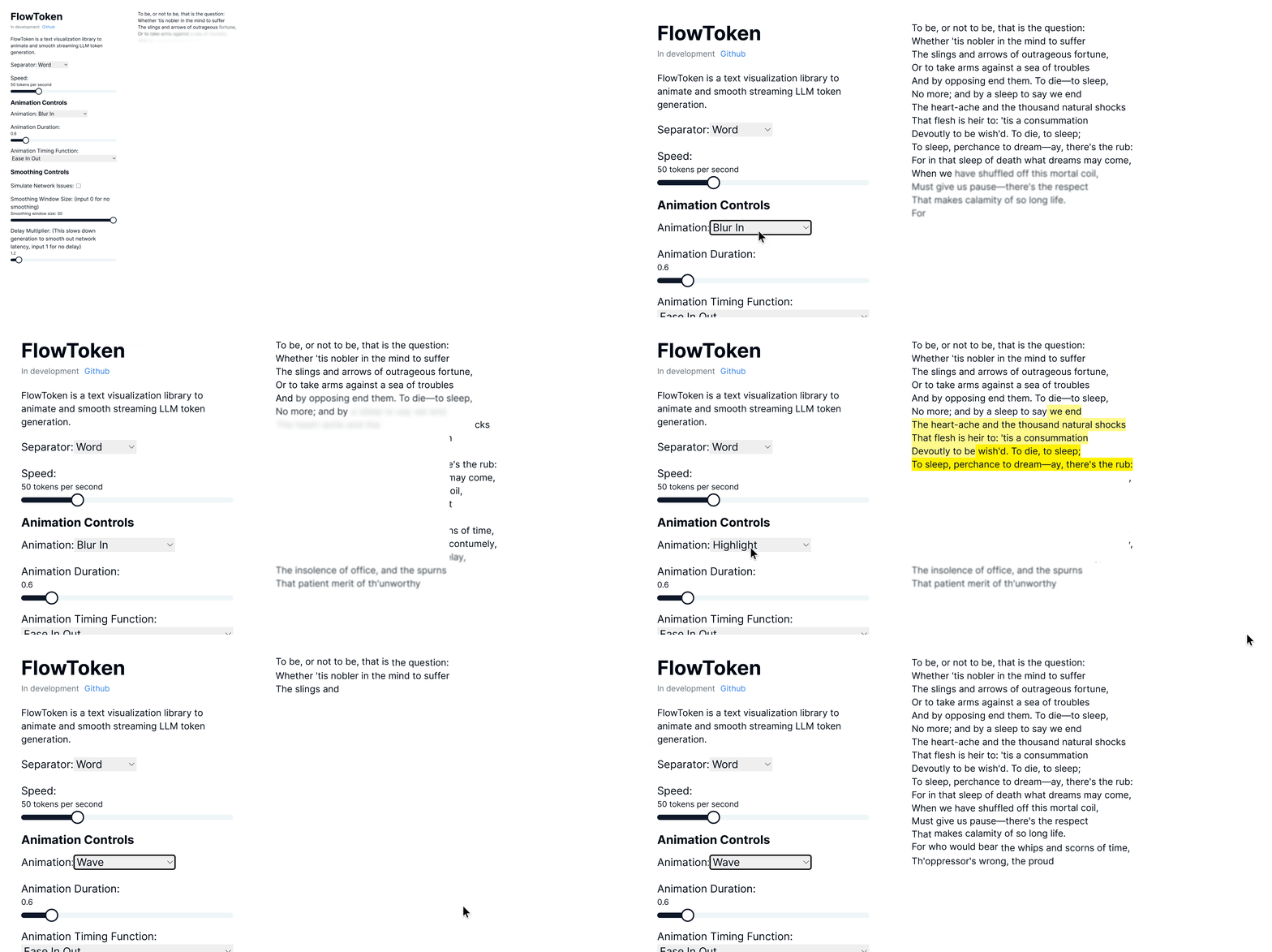
FlowToken is a React component library designed to enhance the visual presentation of text streaming from large language models (LLMs). This library offers a variety of animations that make the text appear smoothly and dynamically, providing an engaging user experience.
Try the demo here: Demo link
FlowToken includes several key features:
- Customizable Animations: A range of animations such as fade, blur-in, drop-in, slide from the left, typewriter effect, word pull-up, flip text, gradual spacing, and more.
- Smooth Text Streaming: Options to control the speed and manner of text appearance to handle the variability in text generation speed.
- Responsive and Lightweight: Optimized for performance and compatibility across all modern browsers.
Install FlowToken using npm:
npm install flowtokenOr using yarn:
yarn add flowtokenTo use markdown, import the AnimatedMarkdown component.
import React from 'react';

import { AnimatedMarkdown } from 'flowtoken';
// import the flowtoken css in order to use the animations
import 'flowtoken/dist/styles.css';

const App = () => {
  return (
    <AnimatedMarkdown
      content="## Hello, world!"
      animation="fadeIn"
      animationDuration="0.5s"
      animationTimingFunction="ease-in-out"
    />
  );
};

export default App;'use client'
import { useChat } from 'ai/react'
import { AnimatedMarkdown } from 'flowtoken';
import 'flowtoken/dist/styles.css';
export default function Chat() {
const { messages, input, handleInputChange, handleSubmit } = useChat()
return (
<div>
{messages.map(m => (
<div key={m.id}>
{m.role}: <AnimatedMarkdown content={m.content}
animation="dropIn"
animationDuration="0.5s"
animationTimingFunction="ease-in-out"
/>
</div>
))}
<form onSubmit={handleSubmit}>
<label>
Say something...
<input
value={input}
onChange={handleInputChange}
/>
</label>
</form>
</div>
)
}You can use custom components by passing a customComponents prop to the AnimatedMarkdown component where the key is xml tag (ex. MyComponent) to match and the value is the component to render. Then just prompt your LLM to output the custom component syntax and it will be rendered with your custom component.
const customComponents = {
  'customcomponent': ({ animateText, node, children, ...props }: any) => {
    return (
      <>
        {animateText(<div {...props}>{children}</div>)}
      </>
    )
  },
}
...
<AnimatedMarkdown content="Hello, world! <customcomponent>This is a custom component</customcomponent>" customComponents={customComponents} />This is an example of a custom component.
- content (string): The text to be displayed.
- sep (
"word"|"char"): How to split and animate the content. Defaults to"word". - animation (string |
null): Name of the CSS animation to apply (e.g.fadeIn,dropIn). Set tonullto disable animations on completed messages. - animationDuration (string): CSS duration of the animation (e.g.
0.6s). - animationTimingFunction (string): CSS timing function for the animation (e.g.
ease,ease-in-out). - codeStyle (object): The syntax-highlighter style object to use for code blocks.
- customComponents (Record<string, React.ComponentType>):
Map of regex patterns or custom tag names to React components. Use this to render arbitrary LLM-emitted syntax. - imgHeight (string): Default height for rendered images (e.g.
200px).
FlowToken supports various CSS animations:
- fadeIn
- blurIn
- typewriter
- slideInFromLeft
- fadeAndScale
- rotateIn
- bounceIn
- elastic
- highlight
- blurAndSharpen
- dropIn
- slideUp
- wave
For custom animations, define your keyframes in CSS wrap it in a class and pass the animation name to the animation prop.
/* custom-styles.css */

@keyframes custom-animation {
  from {
    opacity: 0;
  }
  to {
    opacity: 1;
  }
}

.custom-animation {
  animation: custom-animation 1s ease-in-out;
}
import 'custom-styles.css';
...
<AnimatedMarkdown content="Hello, world!" animation="custom-animation" />To lower the memory footprint, disable animations by setting the animation parameter to null on any completed messages.
If using tailwind with generated markdown, be sure to setup tailwind typography: https://github.com/tailwindlabs/tailwindcss-typography
and add prose lg:prose-md prose-pre:p-0 prose-pre:m-0 prose-pre:bg-transparent to your flowtoken markdown container.
Contributions are welcome! Please feel free to submit pull requests or open issues to suggest features or report bugs.
FlowToken is MIT licensed.


